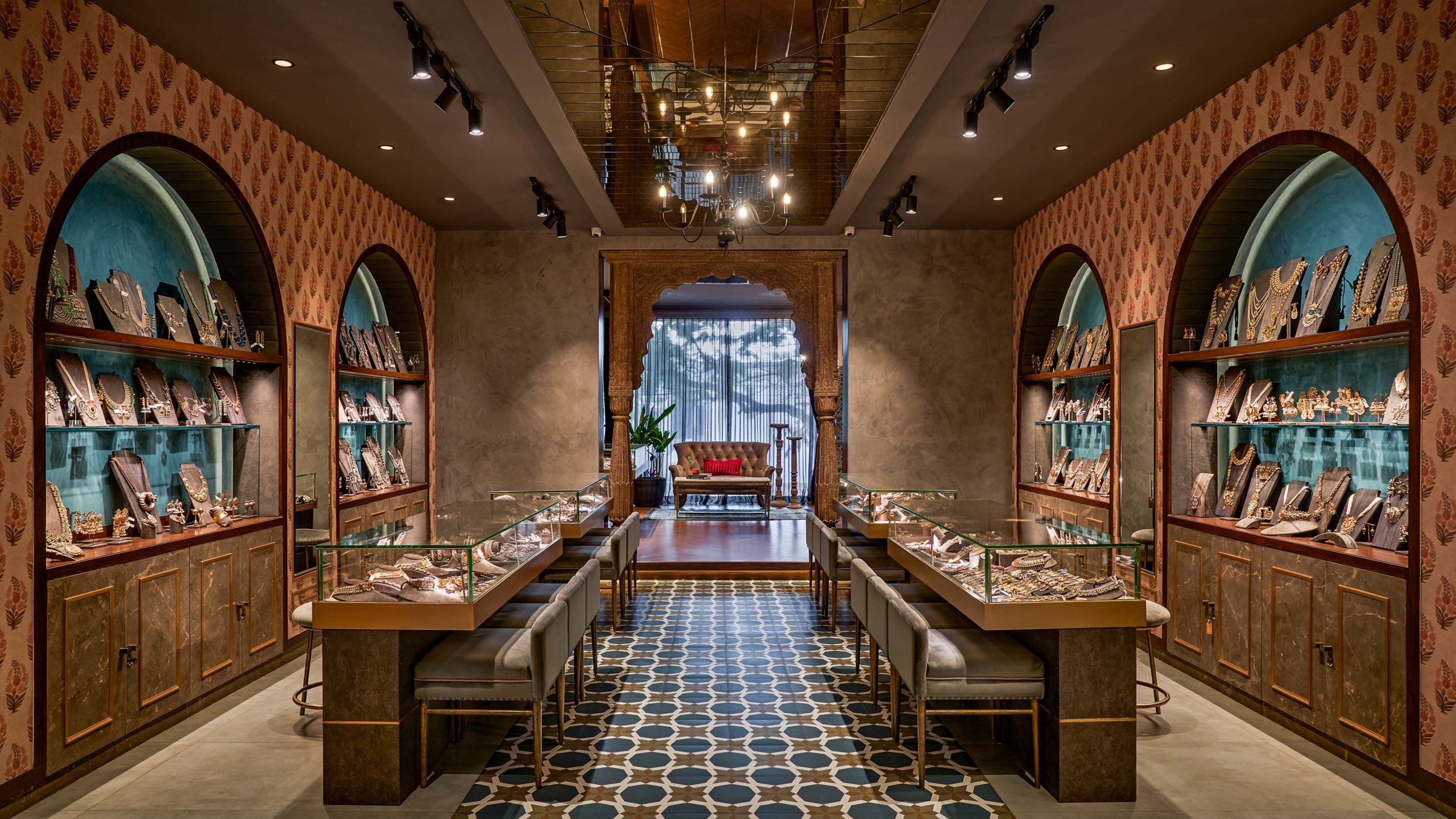
Jewel Box by Arnav is a retail store for silver and gold jewellery on the first floor of a building in a prime locality of Bangalore.
The initial brief and intent was to break away from a traditional jewellery store and make it appeal to a younger customer base. A contrast of rustic & plush finishes like cement and suede, wood & wallpaper, have been used in order to achieve this.
The long profile of the site made it ideal for us to create repetitive sales bays, accentuated by brightly lit arches; which apart from serving as jewellery display, also tie up the entire space together. The bold patterned flooring as well as the use of mirrors on the walls and ceiling are strong elements that give character to the space. The use of antique wooden furniture and brass finished elements lead to a perfect blend between the contemporary and the traditional.
Shot by Shamanth Patil Photography.

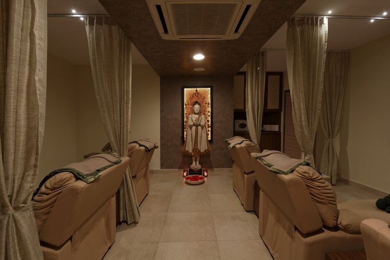
Breaking away from rigid straight lines and giving way to a fluid and sensual flow of spaces, a conscious attempt is made to mold the spa with sensitive spaces for the client, as the functions are very personal. Warm tones and natural textures are used to bring in an earthy, oriental feel while retaining a refined, simplistic language to the space. Subtle accentuation of each area is done using ambient lighting and hand-picked artwork.The fluid reception, waiting lounge and treatment rooms are decorated in woody browns and raw-finished stone. The stark white of the sanitary ware stand out in contrast to the darker depth of the tiles. The salon spaces are decorated in brighter whites, carrying just a trace of wood within. Impressive curved panels of glass are used for complete indulgence in the landscaped deck and the tree-tops of the park beyond. The serene Buddha in the centre of the water body adds the finishing touch, dimly lit with flickering candles. August urns and delicate tea-lights coupled with bright peppy furnishings lend to the space a hint of nostalgia.

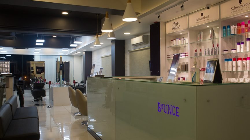
There exists a certain uniformity in all elements utilized in the design of any Bounce outlet. However here at BEL Road, to cater to the young crowd that rushes in from the nearby universities, a slight modification in style was required.
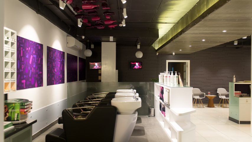
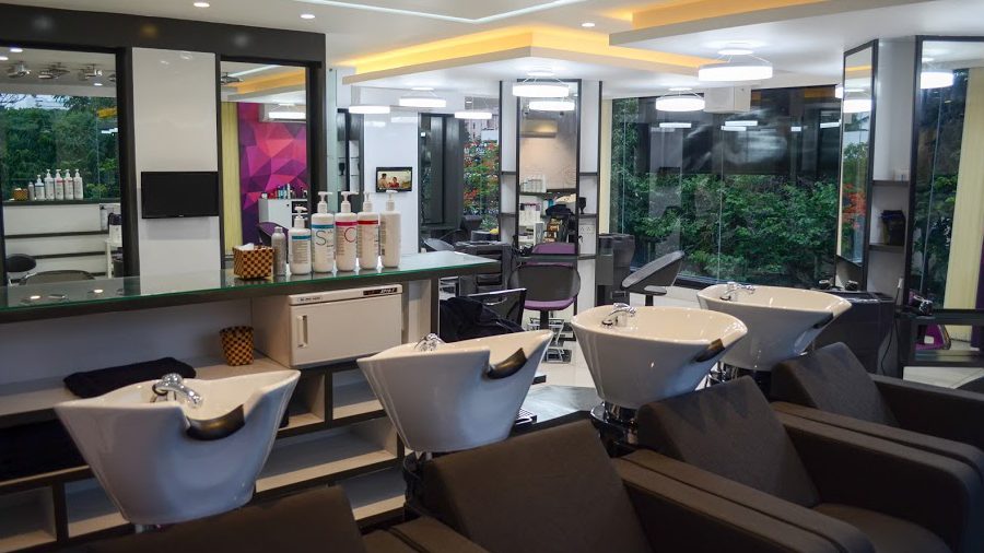
Funky lighting and groovy elements of colour magnified the playfulness in the stylist’s arena. The area was quite tight to fit in everything to make it an ideal spa. This called for a strategic approach in interior planning. The hair shower units were placed one behind the other through the passage to maximise space. Efficient planning was the need of the hour and was successfully implemented to bring to life this established salon.

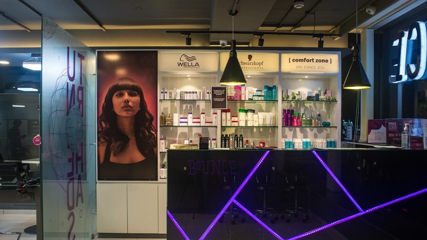
This fashionable salon is psychologically soothing to enhance a customer’s already pleasant physical experience. Black, Grey and White have been intertwined with tinges of Purple – signifying Bounce’s authenticity. Alongside low intensity ambient lighting, this scheme of interiors provides nothing short of a tranquilizing and relaxed in-house experience.
To add to all of this, certain walls are cladded with bricks, finished with shades of Grey to amplify a sense of rejuvenation in all who walk in. A minimal and highly functional interior layout to appeal subtly yet imbibing a strong sense of comfort, has been accomplished. From the entrance, to the waiting lounge, to the nail bar cum hair wash area, to the separately placed hair styling and colouring units, to the pedicure areas and treatment rooms, one can always feel only at ease to access any area in this layout.

The Bounce outlet home to JP Nagar is relatively lavish in terms of size. The general essence of Bounce is upheld across the entire space. Due to the larger size, a massage room and spa are also housed here. Generous use of cove lighting results in a highly vibrant and energetic experience. Certain touches of excitement are induced with articulations on the glass by the reception, lighting on the wall and reducing the luminosity as you go into the closed areas. This Bounce is one of the more luxurious ones of its kind.

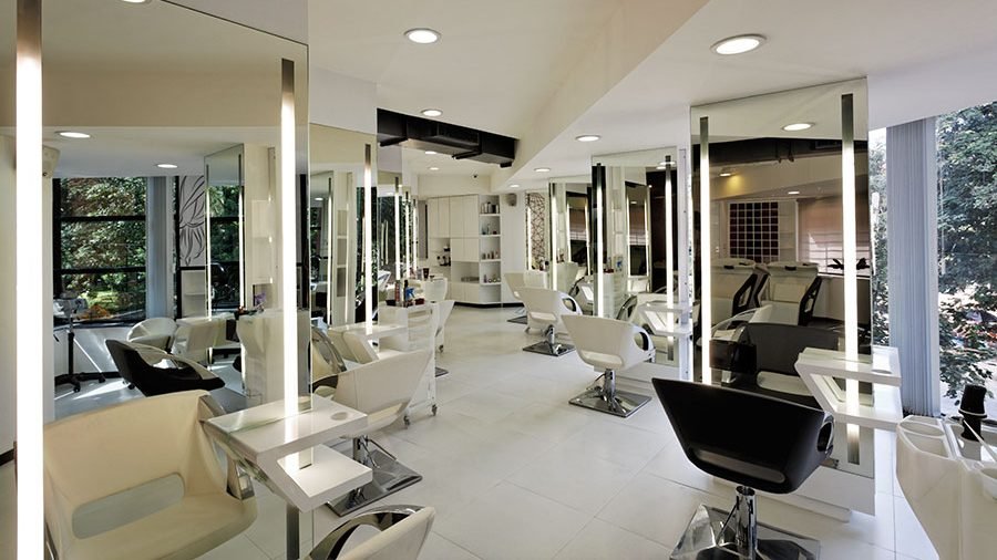
Indira Nagar, a prime locality of Bengaluru, with all its variety and energy has received a Bounce outlet much like the area itself. The signature style of Bounce of a cool, contemporary and cutting edge interior is achieved but in this location with the added attraction of large landscaped balconies. Cool whites have been utilised be it on the flooing, walls and ceilings, yet the differing textures on each create the dynamism within the space. This outlet possesses two contrasting types of cove lighting a yellow and a white that merge together seamlessly. Splashes of colour in terms of accents, and the green of the landscape through the glazing as well as reflected on the mirrors create a attractive visual contrast. On the whole, this subtly differing Bounce outlet holds its own in one of Bengaluru’s most happening areas.

Keeping the interiors in ethereal white like a backdrop, the space is accented by the heightened contrast of the vivid clients, making them stand out as the focal point; thus showcasing the handiwork of the salon itself in the process. While the larger impact is made by the clean mutes, the salon is subtly wrapped in whispers of rusticity – by the raw finish of the exposed air-con ducts, the dark natural stone used to clad accent walls in the rooms or the coarse finish of the exposed white-painted brick wall that encloses the VIP room.The planning is treated in three layers – the hair styling, color and nail bar areas are kept more open to augment interaction; the hair-wash has a more semi-public feel where the privacy and comfort of the customer is retained and yet is hidden away; and the VIP and treatment rooms are potted along the quieter zone, towards the rear. The overall look of the salon is understated chic. The design language is largely minimalist emphasizing on the the fluidity in plan, which is also reflected in the interior finishes and contouring of furniture. The pure white ambience sets the stage for the extremely proficient and sanitary / hygienic experience that is offered.The stark clinical working spaces of the interiors are set against the staggering foliage through the front facade to balance it out.

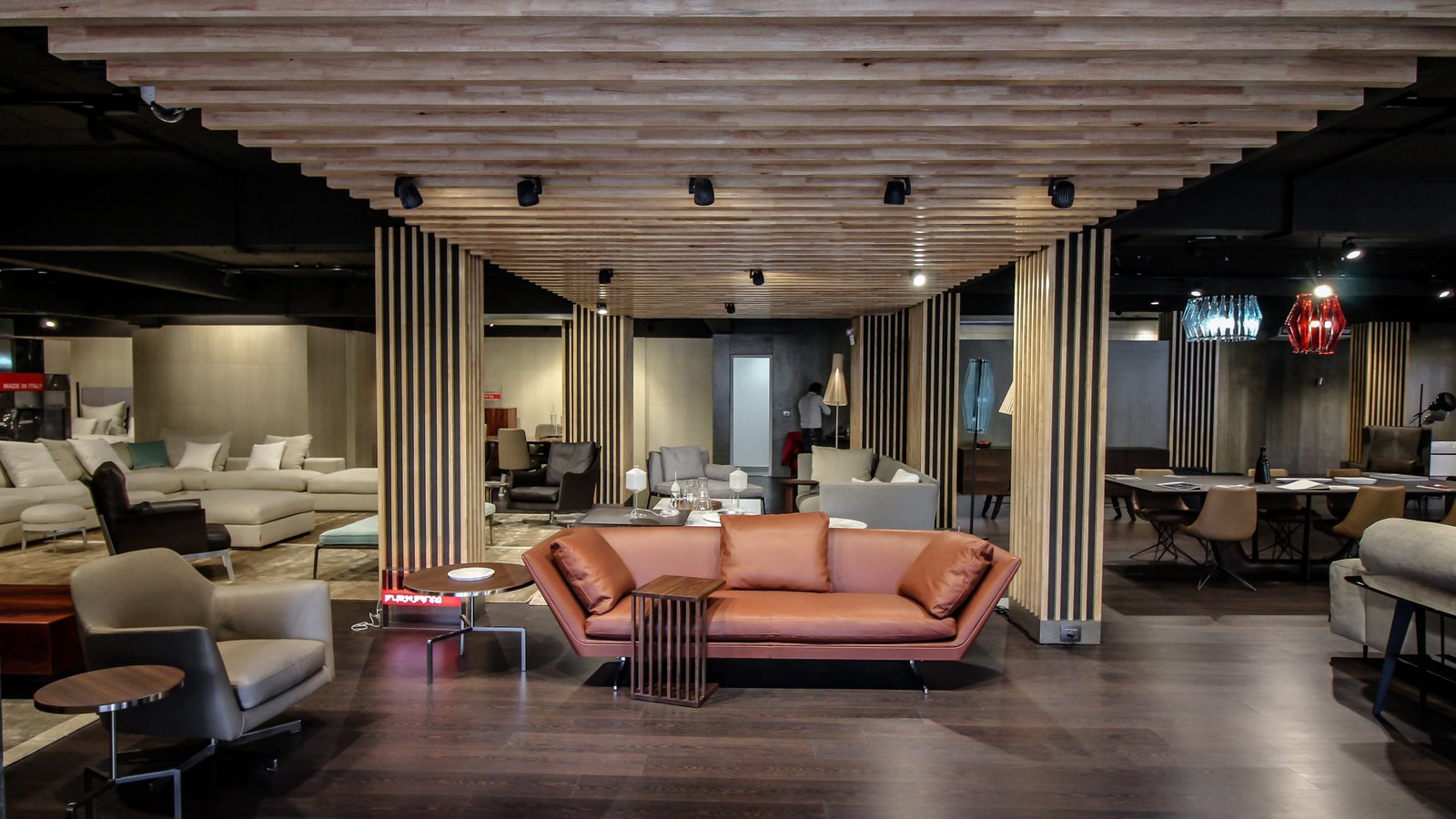
This retail store for high-end italian furniture brands came in with a site full of challenges. With a hotel on the upper level, the space was filled with plumbing pipes within an already low ceiling. To work around these factors, the planning and detailing were undertaken with careful thought. Furniture bays are chalked out to draw the eye to specific sections in a rhythmic format. Vertical wooden fluting treated over the columns in a contemporary style further thin down the mass and a subtle grey palette with a wooden floor allow the furniture to stand out. The woodwork and lighting are an adaptation of the brand identity. A simple minimal facade with signage perched on a heavy metal section and a stark white door call out to the potential customer on the busy road that it stands on.

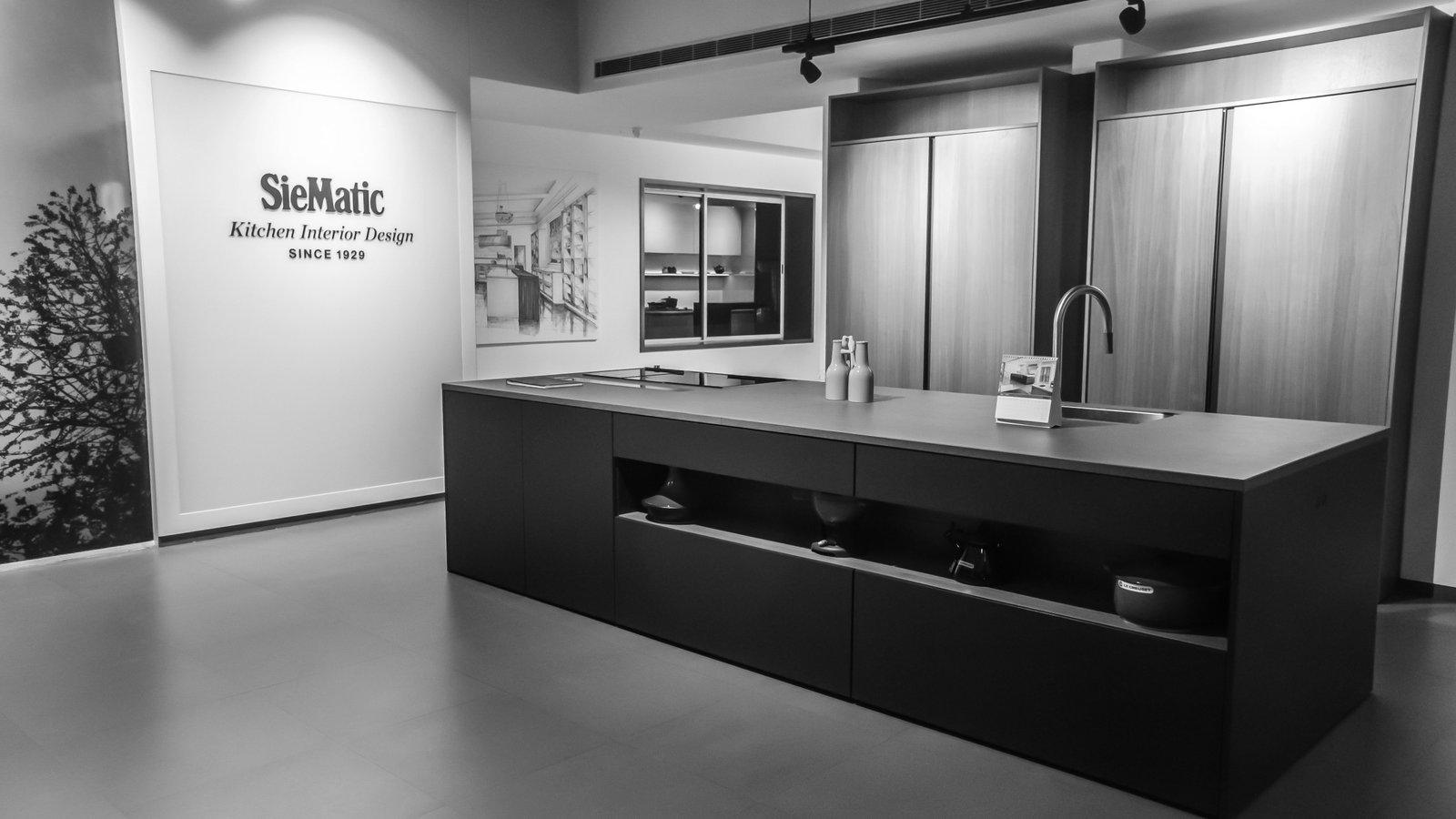
Siematic, a German kitchen brand, sits on the ground floor of a busy street of the city. The bustle and chaos of the dense fabric around this site are quickly forgotten with the minimalist style of the interiors. Every pocket forms a new kitchen space that is styled to compliment the kitchen on display. The office in the rear is light and open and is coupled with a presentation space for client meetings. Lighting is flexible and content-specific in that the elements on display are beautifully highlighted while the surroundings wash away from sight.

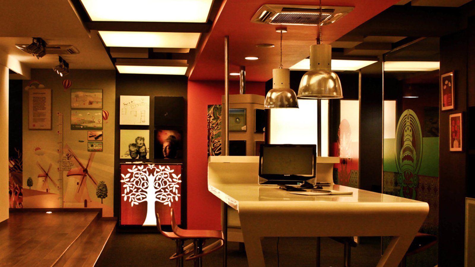
The name of this store – ‘Glass and Wall Expressions Experience Centre’ formed the genesis of the design.The basic client requirement revolved around the word ‘experience’ – the customer experiencing all the products the store has to offer, in terms of sight, touch and feel and in do it yourself experiments.The cladding of the pergolas at the entry, the varied glass films, all the wall coverings inside the store, the films on the light boxes along the ceiling, and the pull out panels all form a part of the see, touch and feel experience. Several huddle rooms and a playtable is provided to make the process of selection a fun and interactive. The application zone is fitted with surfaces where the customers experience for themselves the ease of the application process. All the elements were designed as modules for easy replication in future chain stores.

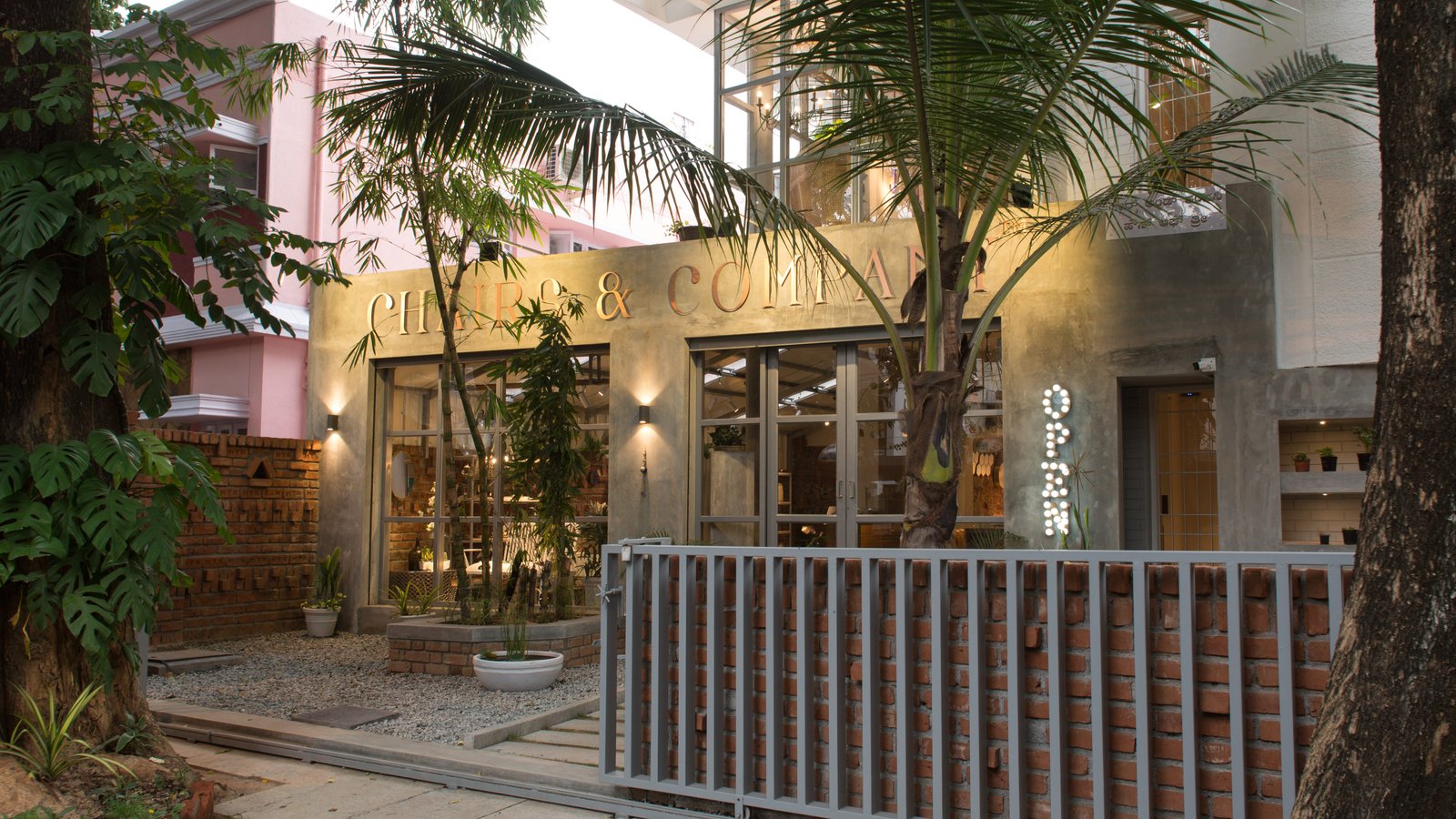
This flagship store for a bespoke furniture maker is a space that was envisioned to be full of its own life, non-conforming to any preset norms. A busy backdrop of rhythmic brick brings alive the jewels of furniture lovingly curated and created by its owner. From the first step into this store is an attempt to take you into another world of treasures – from intricate woodwork to marble inlays to swanky steel frames – all laid out in an always-evolving but open layout, each nook screaming to be discovered. The facade and floors in a well-finished exposed cement, accentuated by the twinkling lights dotting the store complete the look.

