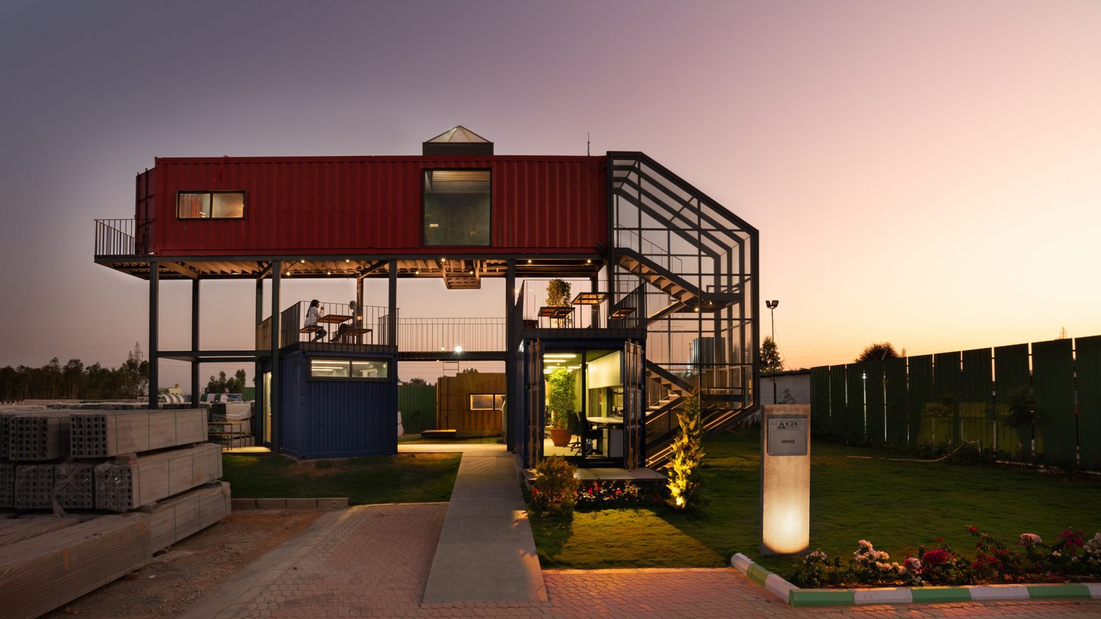
The project was to create an office for a precast concreting factory along with an exhibition space and an experience centre. As the site is located in an industrial area, so to keep with the same language, but at the same make it stand out, was the design challenge we undertook. Other considerations that had to be taken were the cost-effectiveness and ventilation. Towards the industrial appeal, shipping containers were re-used in their original condition as the carcasses for the spaces. Exposed service lines and interior insulation created for a better experiential feel for the office’s purpose. Primary colours were used to make the containers stand out against all the concrete. The layout was designed such that the main areas of use would look into a water body. The water body’s other feature was the cooling affect it would have on the surrounding spaces as all the windows were designed to help in the ventilation of the interior spaces.
A ramp leads the users into the centre of the site surrounded by three containers – an experience centre, an office space, and a dining and sanitary area. The first floor utilities the top of all the containers forming a deck space that can be used as a meeting area and an external exhibition area. The last floor is a single container with a cabin for the MD and a conference room. All the floors are interconnected through one the main design features of the project- the cantilever staircase encased in clear glass.
The overall effect of the design was to create an almost sculptural installation out of the spaces.
category: corporate
Law Firm
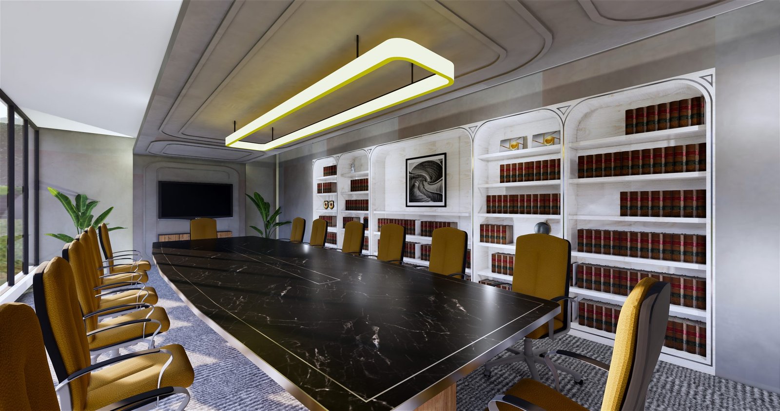
The clients gave us a free hand to design the office as we desired, but keeping in mind the formal nature of the law firm. Our initial idea was to move away from linear typical lines of office design and introduce a slightly softer, curved composition of shapes in their daily journey. At the same time the space was to be subtly luxurious and formal.
Inspired by the art-deco movement, the layout, materials and interior silhouettes took form. Neutral material palette of statuario marble, grey terrazzo with white chips and brush finished SS strips is inlaid and warm oak wood paneling has been used to offset the subtle tones. The partitions made of glass is reminiscent of the 30’s.
The curvilinear lines are a constant element across the interiors, reflecting the wall paneling, partitions, and layout plan. The double height library transports one back to old university libraries with its double height, classical shelves and leather tufted chairs.
The neutral palette of materials with the patterned textures are complemented by the deep blue distress painted feature walls and rust orange upholstery. While the office retains its formal character, the art-deco inspired design approach has given a unique spin to a typical office.
Vaishnavi Serene
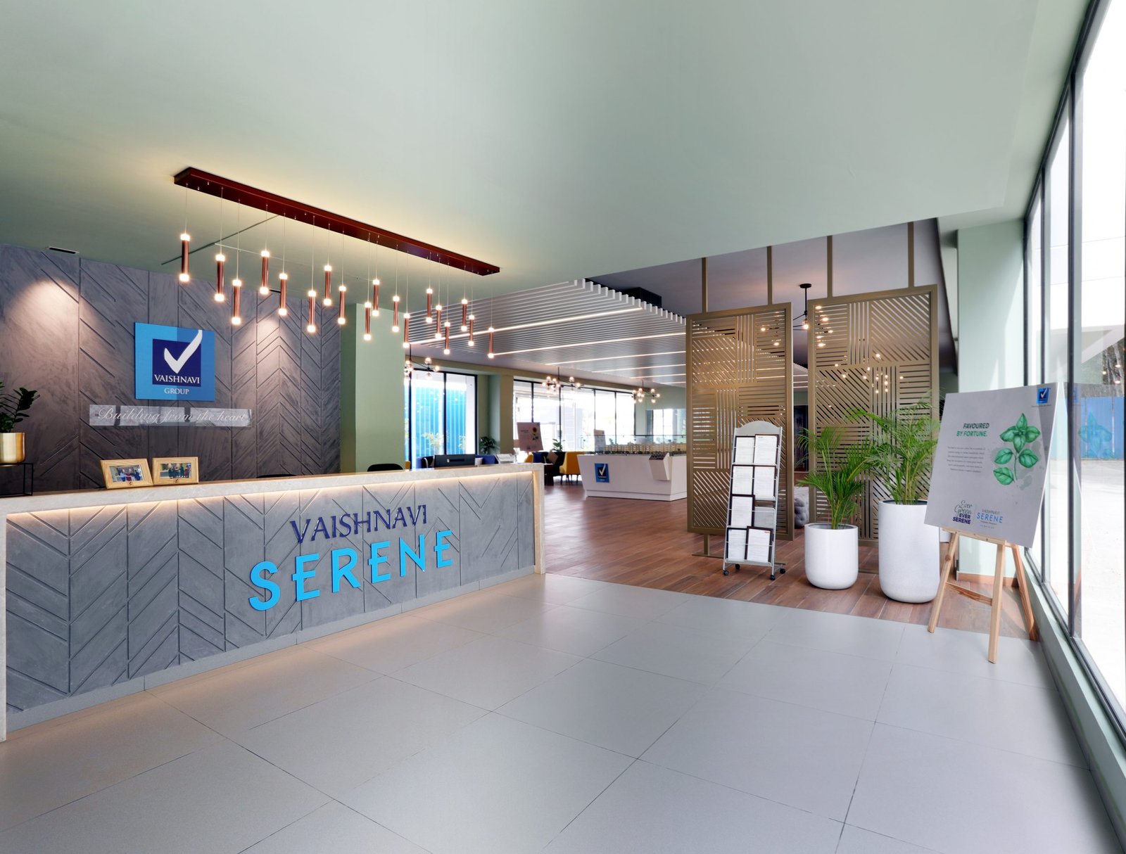
The brief given to us was to create a marketing lounge/office which embodied Vaishnavi Serene’s principle “Budgeted Luxury”. The space needed to appeal to the sensibilities of young families, visiting to purchase their dream home. It had to be kept in mind that the office would be later converted into an event space for the clubhouse.
The glazing on either sides letting plenty of light in, played a pivotal role in the planning. We created a niche reception with the AV room behind. The discussion rooms, accounts, etc were zoned to the opposite end leaving an expansive area for the visitors. Instead of the typical cluster seating provided in lounges, we custom-made the furniture pieces to suit the free flowing arrangement.
A cheerful take on a formal contemporary lounge by juxtaposing an unusual color palette of light olive green, bright warm yellows and deep blue with elements of bronze, cement and wood.
Along the linear volume, rafted ceiling above the central line neatly conceals the AC ducts and throws focus on the model. The relaxed, quietly luxurious mood is heightened by the curvilinear low couches, tufted benches flanked by copious stands of leafy pots, invites and puts the potential buyer at ease.
P-Terrace Lounge
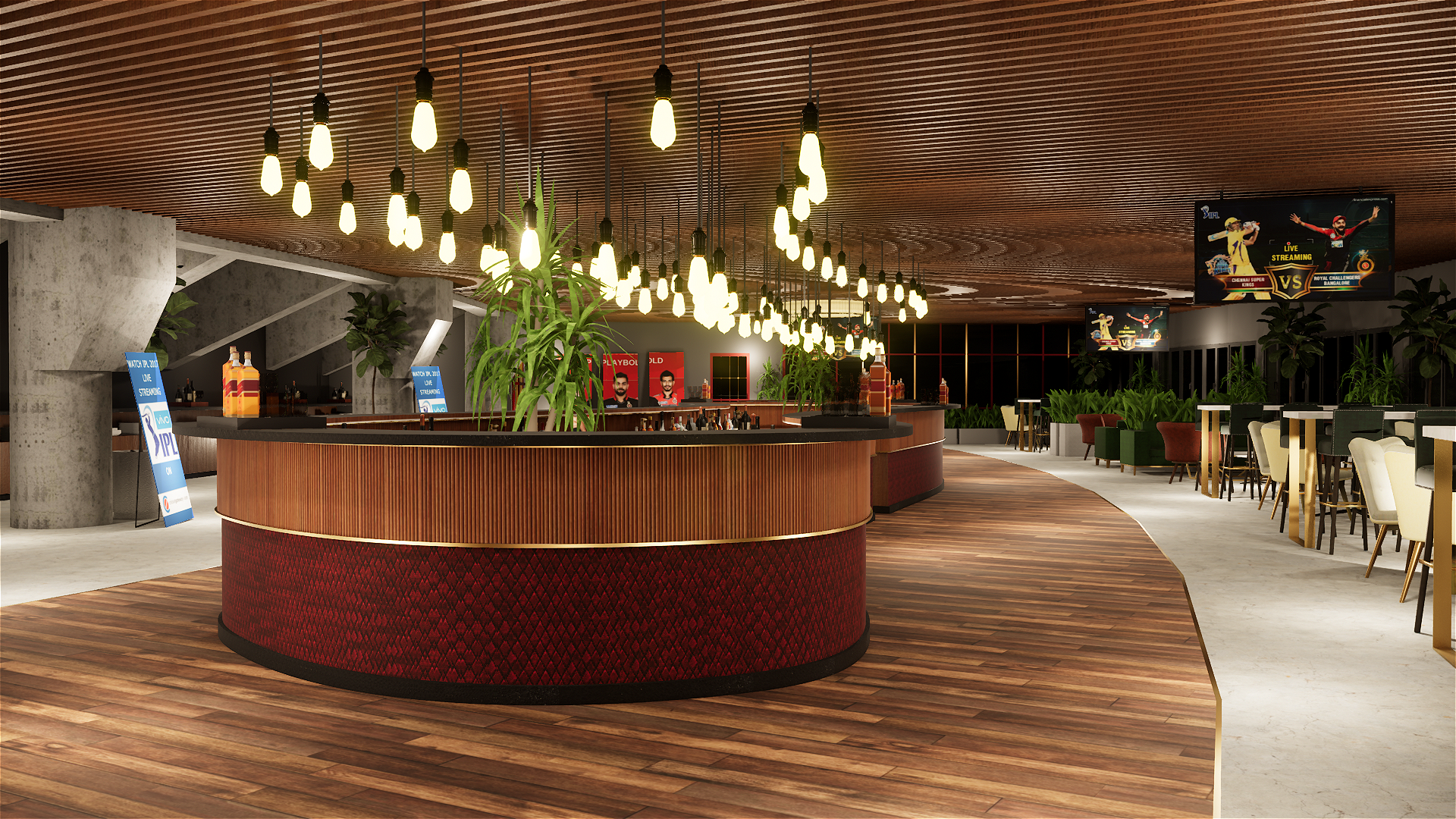
The project brief from the Karnataka State Cricket Association was to renovate the current VIP lounge for the IPL season. The present site posed two challenges, the low hung ceiling, and the existing services. On visiting the site we proposed the demolition of the rooms used as accomodation to allow light and ventilation from the curved periphery.
The idea from the beginning was to create a space that reflected the spirit of Bangalore and it’s favourites Royal Challengers. The planning was determined by the curved nature of the space. A large central curved bar with seating on either side, a buffet counter and toilets at the end. The flooring was designed as combination of wood and cement with a brass strip.
Rafters with clusters of tungsten bulbs above the bar made it the focal point that would draw ones attention from every corner. Different types of seating clusters with low tables, and high tables was designed. Plush red leather panelling on the bar, red upholstered chairs with elements of bronze in the furniture reflected the brand’s colours. The golden hued space, with the warmth of the wood elements and crimson elements perfectly embodied the spirit of the home team.
Ramen Ofisu I
After spending ten years in a fairly traditional and plain office, the Indo Nissin team was yearning for a bright new space. The site with three sides of glazing allowed us to plan in such a way that most of the office was always well lit. Automation was used for daylight saving by syncing up the blinds and lighting to a central system. Being a food company, the kitchen and dining was planned to act as a central court and gathering space, off which all other activities fed. Heavy foliage peppers the fully indoor space to provide relief and increase productivity. Straight lines, simple finishes, cement and wood come together to form a simple, modern and flexible office.
Loud Chilli
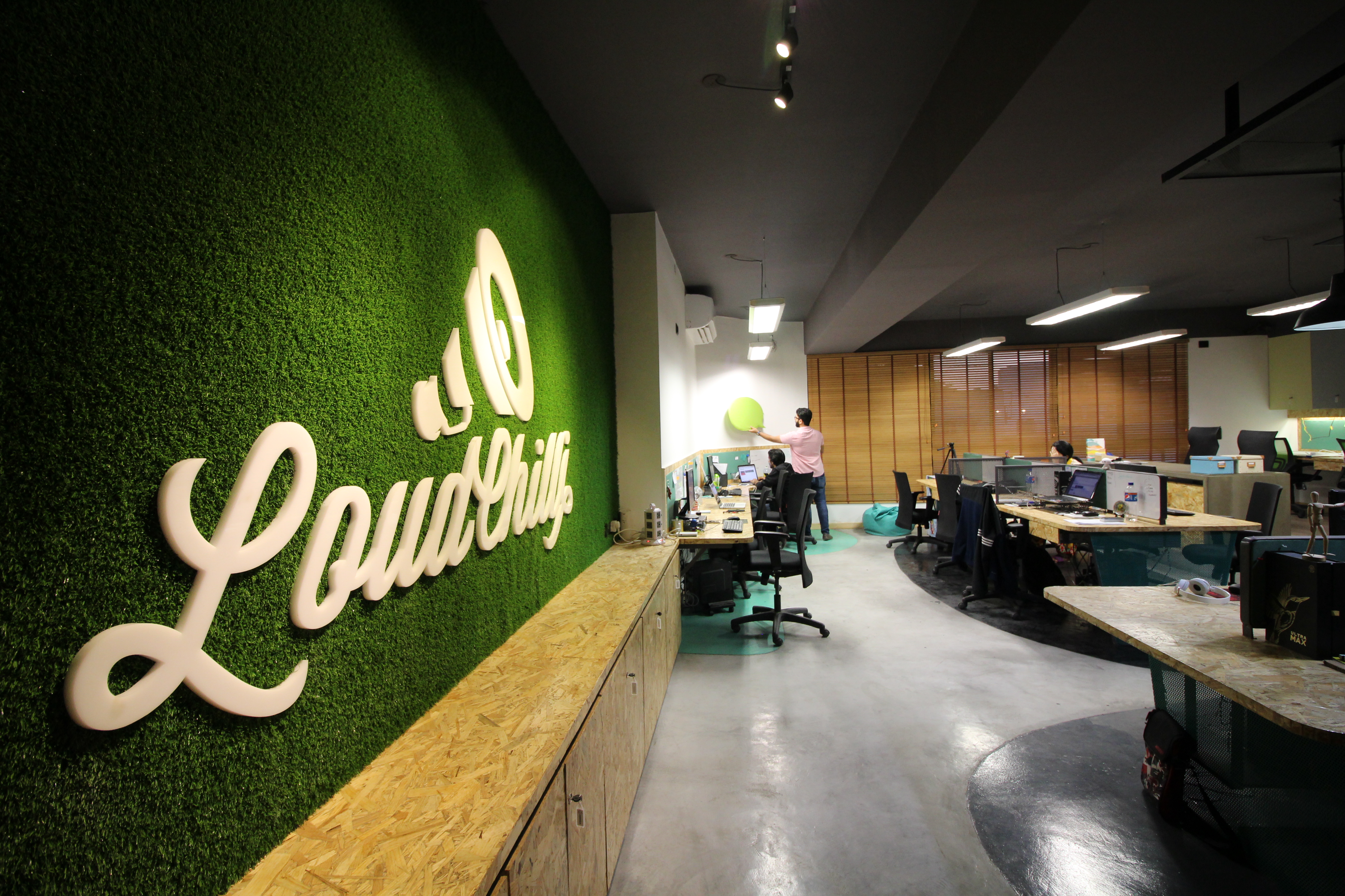
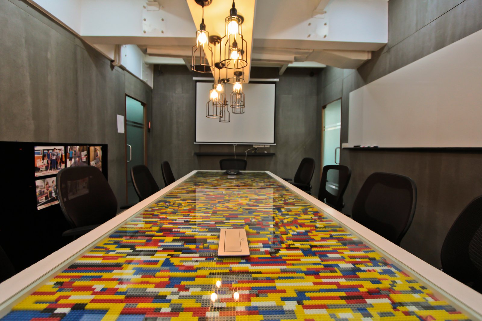
The client’s brief was to deliver the diametric opposite of the modern corporate office interior. Instead of muting the space to promote serious business, we intended to create an open, interactive space with certain elements of quirk that captures the spirit of the fun loving advertising agency.The workstations are designed with MS flats framework, varnished chipboard table tops, and perforated metal sheet between each workspace lending it a rugged industrial feel. The pastel colored cabinets give the space a sense of freshness. The signage wall detailed using artificial turf catches one’s attention from any part of the office. The brick texture running through the length of the space acts as a unifying element. Seating around the circular column in the breakout area, metal rings around the column to hang plants in the work area, and speech bubbles on the floor demarcating the work stations are few of the quirky elements of the office. The exposed network of bulbs on the ceiling enhances the casual setting. The space designed thus acts as the perfect bouncing board for the ideas of the dynamic and creative professionals working at the agency.
Law Firm
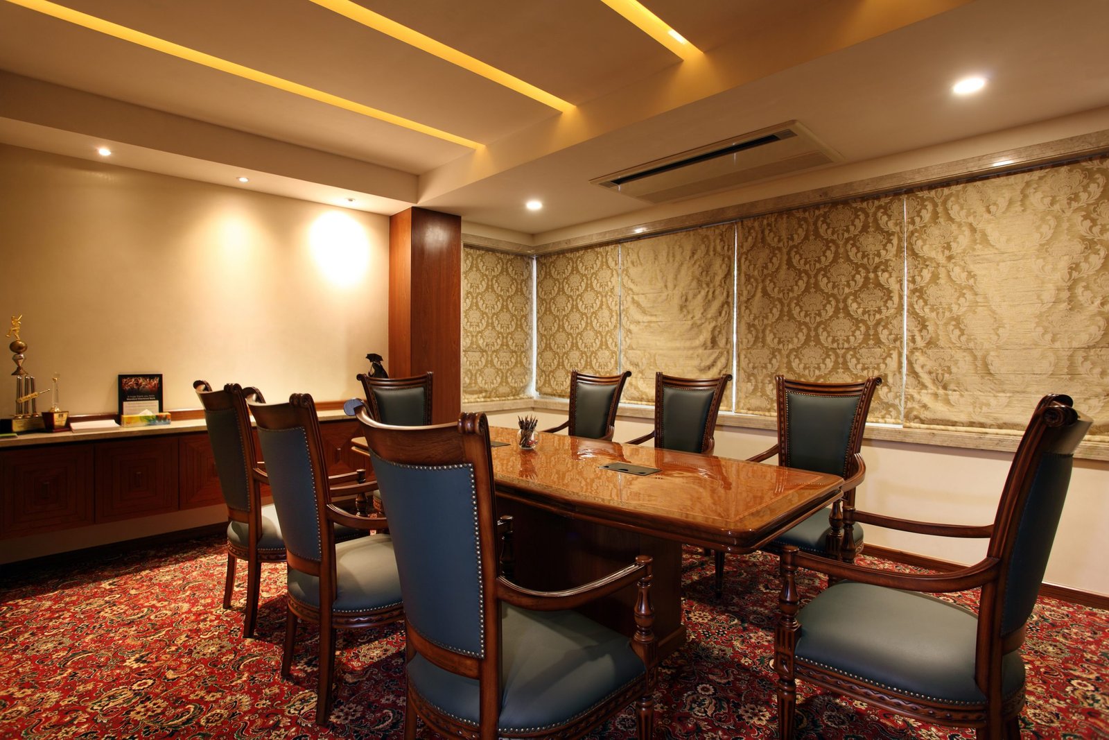
The interior design of this pedigree law firm exudes old world “establishment” and luxury given the nature of clients walking through the doors of this space. The client facing areas comprising of the reception, conference rooms and meeting rooms are conceived with the extensive use of marble and wood detailing. The conference rooms have luxury carpets as flooring, and the use of warm wallpapers to accent the wood and marble. Lighting is used carefully to provide a sense of understated luxury.
Break Bounce
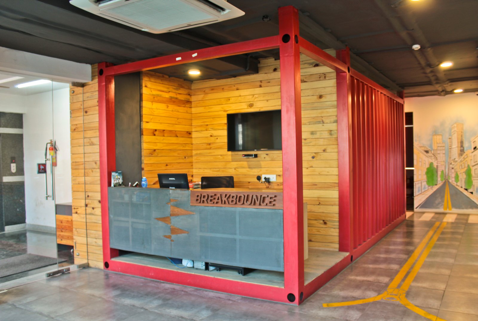
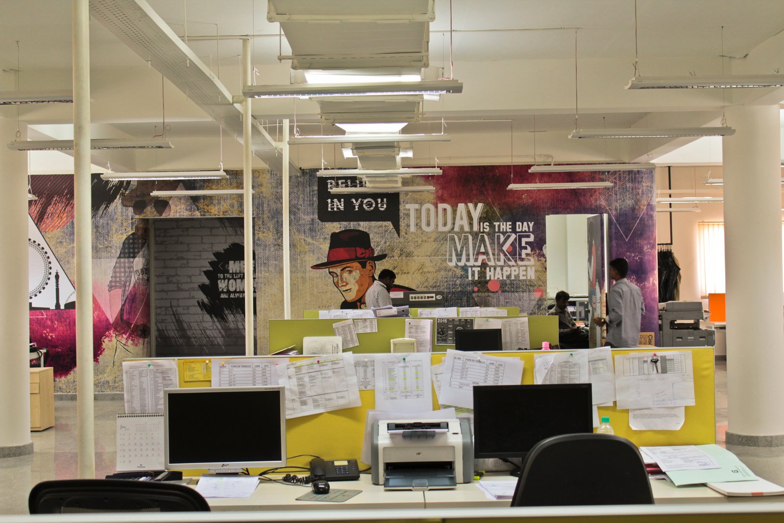
A retail arm of GoldenSeam Ltd., this office faced a similar strategy towards the design process with the idea of using their brand and products as the highlights. Being a streetwear brand, we worked the interiors such that the street essence and a vibrant playful industrial vibe was rendered across the spaces. Extensive use of light colored wood and rustic grey floor finishes facilitated this intent. Metal container units were used to define the closed spaces. All these elements added to the raw quintessence of the 3800 sq. ft. workspace.The visual merchandise area had its own identity with a number of seasonal themes that supported their more timely relevant designs. On the other hand, the showrooms were defined with steel grill like flooring with chain elevations and stands that helped maximise the vibrance of their funky textiles.The planning of the whole area was again focused on segregating the spaces clearly as per function. The workspace and client units never cross paths. The executive areas anchor the transition between those and the divisions. Clear walkways and corridors define the circulation. The essence of the brand’s ideologies such as “funky”, “expressive”, “fun”, “youthful” are brought out through the spaces and justified with clever circulation and zoning.
Delhi Airport Lounge
The brief for the Delhi Airport VIP lounge was to create a luxe, yet comfortable atmosphere for the VIPs to lounge and relax while awaiting their flights.
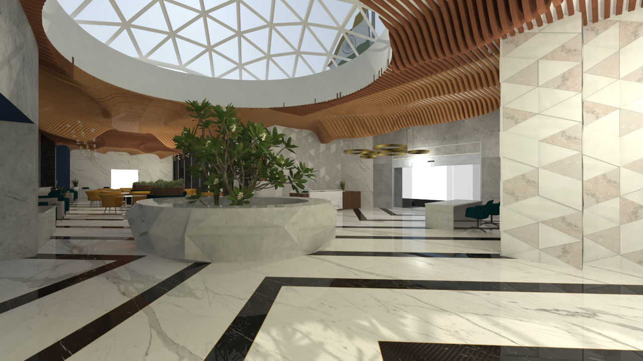
The notion of luxury however goes beyond the material palette implemented in a space. The entrance is well defined leading to the central focal point of the large faceted indoor planter. The domed skylight brings in plenty of light and the trusses create interesting shadows across the central spine. The domed ceiling along with the planter forms the centre of the two axis between the access and types of seating. The volume of the high ceiling was further emphasized by the dynamic baffle ceiling. It also serves as a connecting element between the external facade and the interiors.
Conference room, VVIP lounge, kiosk, restrooms, and the other enclosed spaces have been zoned to the front of the road facing side of the building. This was done to ensure the main lounge area had maximum visibility of the runway.
The dynamic form of the false ceiling is further extended to the serpentine seater with planters in the middle and forming clusters on either side. Drawing from Delhi’s rich architecture heritage a luxe material palette of different types of marbles, bronze finishes, deep velvet hues have been used. However, it is implemented in a contemporary fashion with straight clean lines. The luxe pallete is balanced by the warmth of the wooden finished baffle ceiling and landscaped elements creating a luxurious, yet comfortable inviting space.
Quess Corp
Quess Corp, one of India’s largest HR & People management companies, required a new headquarters for their ever expanding corporation. The design creates islands of glass cabins and meeting spaces in the center with open plan workstations on the periphery with access to natural daylight. The central islands are spaces for interaction, the glass cabins wrapped with inspirational graphics and branding. The columns within the open plan areas are treated with colourful canopies at the ceiling. The third floor takes on a more formal outlook as the management and staff are seated here.
350 desks are seated within 30,000 sft with an additional 10,000 sft for the dining hall, gym and classrooms.
Expo Freight Limited
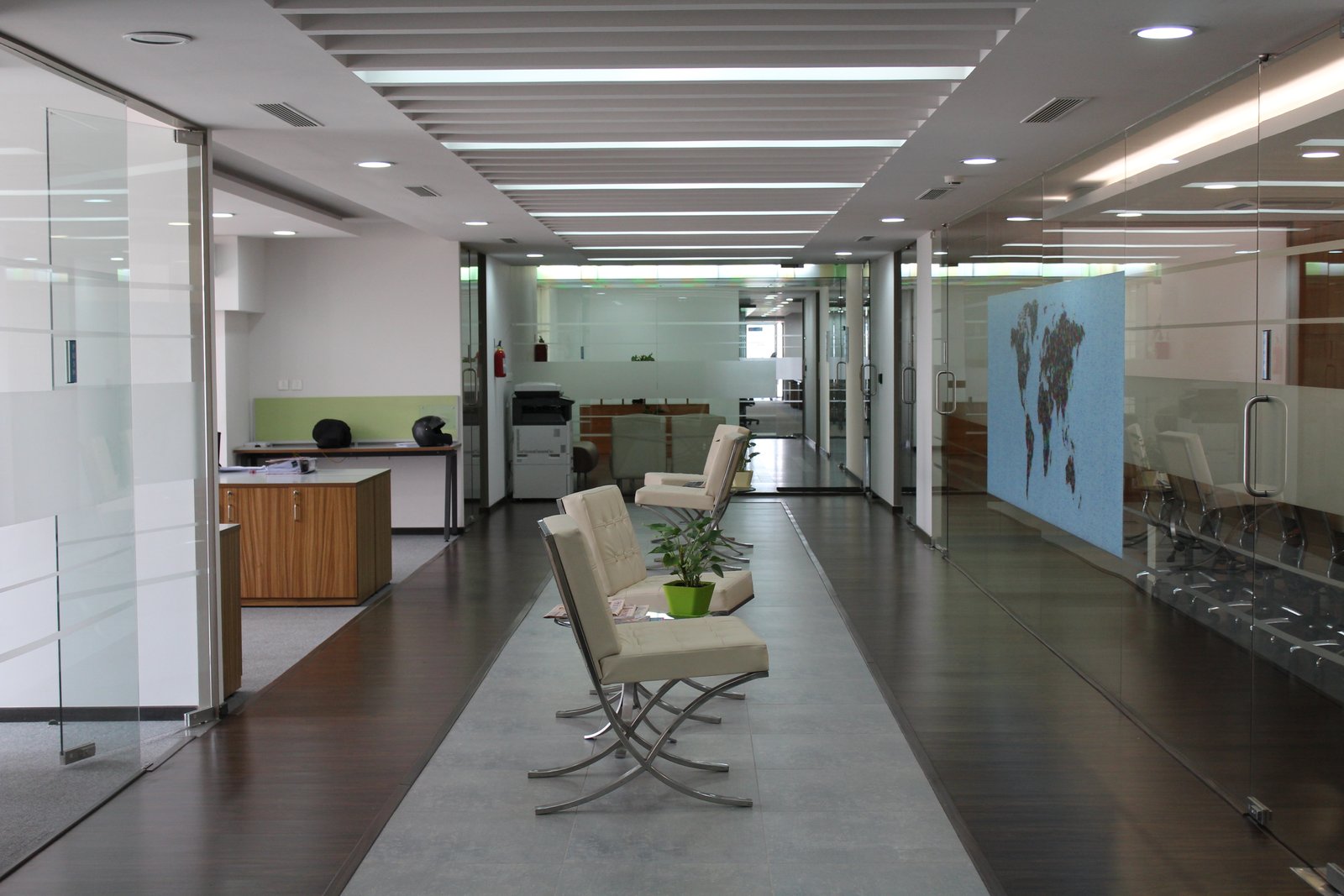
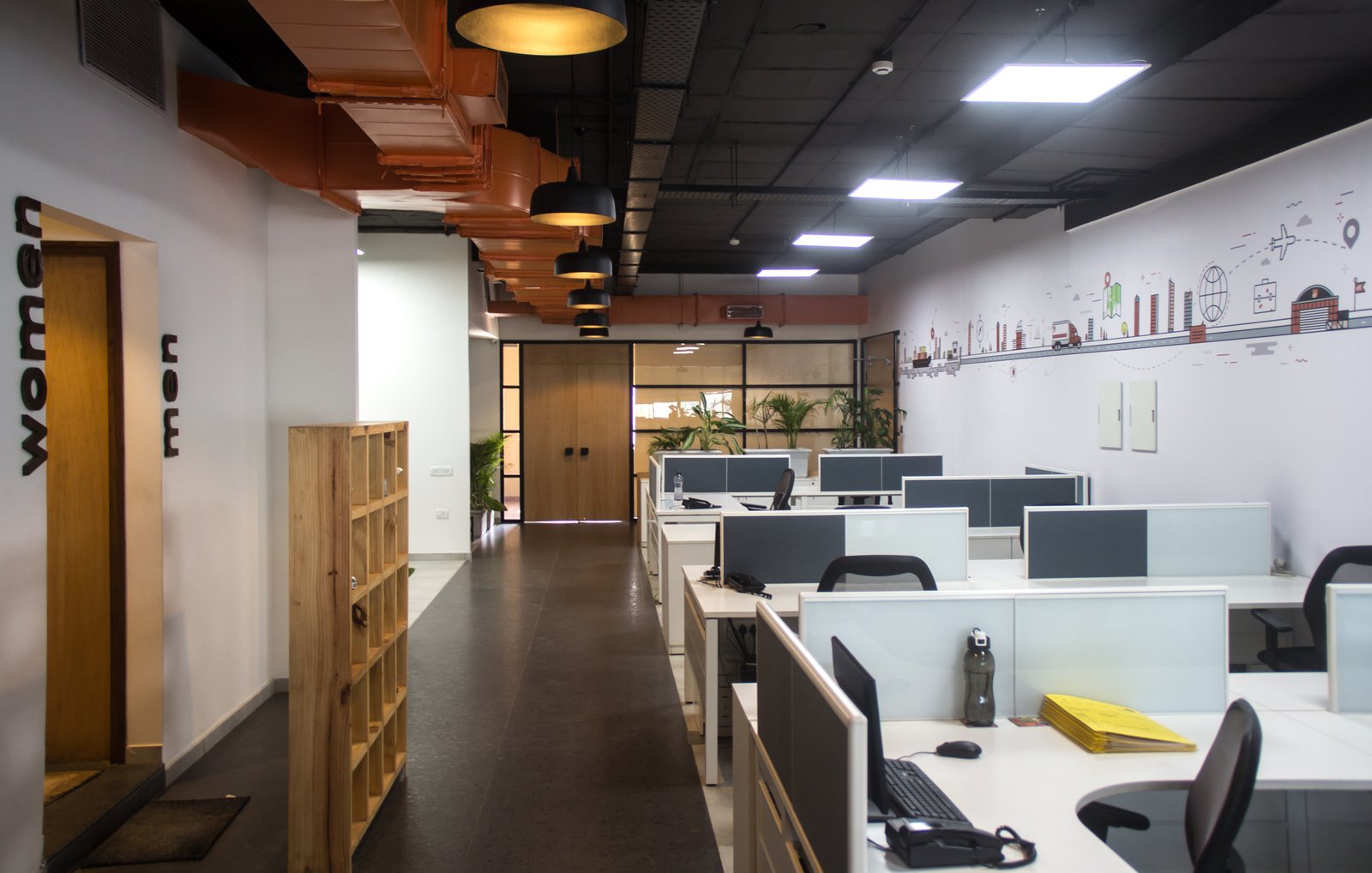
An office for a freight and logistics company, the design idea behind this project was to simplify, declutter and open-out the space to increase light and interaction within the office environment. An open office concept, an exposed ceiling along with break-out spaces and a large inviting terrace cafe was a completely new feel from the old workspace that the company moved from. Use of cost-effective materials made it a great challenge to achieve the expected finishes. Additionally, exploiting the availability of ample light from the East allowed us to work out a smarter lighting system and save on cost. We also fabricated various elements of the space on site – such as select light fittings, manager tables and door handles – to add to the personalization of the space, give it some brand value and go easy on the budget in hand.
SLK
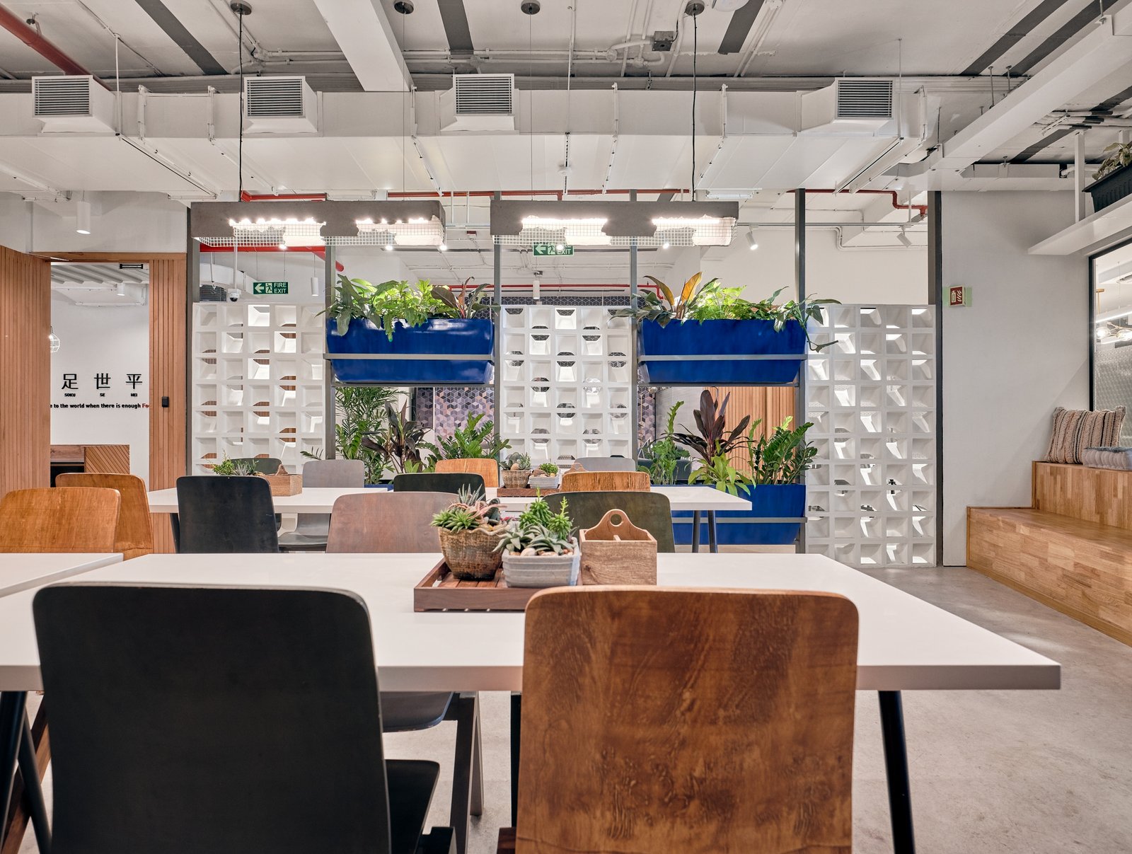
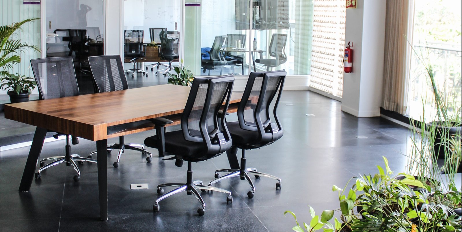
This is the headquarters for a software services company. This included a couple of ODCs with a cumulative capacity of 180 pax with the remaining area dedicated to executives offices, boardrooms and an experience center along with other service requirements.The interior design aims at providing a healthy and a more natural office environment. The proposal reflected the ideals of a steadily growing company, i.e. commitment to quality and pride in human assets. The idea was to reinforce the quality of the work environment not in terms of just swanky office space, but an attempt to cater to the human senses of sight, smell and touch .The design brought in fresh planted elements for cleaner air, better aesthetics, natural smell and access to daylight. Almost 25 percent of the area is dedicated to internal gardens, not only on the fringes but right at the heart of circulation spaces hence it becomes a daily experience to walk through the greens on the way to work.
Internal pathways were introduced diagonally which enabled quick thoroughfare between different departments.This also added dynamism to the space without compromising too heavily on geometrical planning. ODCs were planned in such a way that they could be merged via detachable partitions. Executive cabins ‘enclose’ a green zone while keeping the windows free of obstruction. This enabled the soft north light to penetrate deep into the building.
Golden Seams Factory
In this highly busy and engaging work space for a renowned Textile brand, the interior is the hero in the dark. The interiors have been designed and manipulated to strengthen the clothing prototypes’ vibrant hues and textures. All the corridor spaces have light Grey flooring with rough textured walls that look into the surrounding closed spaces through their glass enclosures. This supports their rugged designs for outdoor wear and aids a sense of connectivity on the whole office. The spaces seem street – like, with up ‘n’ down lighting. The furniture in each space is monochrome with the flooring being solid tinctures of primary colours to classify each space accordingly.
The showrooms for clients and visual merchandising areas assist as the highlighting zones of the whole project. The first showroom for colourful wear has been equipped with seamless Grey flooring and cement finish walls to magnify the colours’ vibrance. The denim showroom has wooden flooring along with Grey walls that aggrandize the denim’s strong texture. The visual merchandising area changes themes according to season and suitable clothing, with mannequins posing as an interesting entrance feature to anyone who visits.
To help the busy office work without chaos, we have segregated the clients’ interaction areas and workspace areas using the executive zone as the partition. A clear definition of functions has provided a way of orienting oneself.
Happy
A dynamic workspace for a dynamic advertising firm was the fundamental idea behind this project. The space had to incorporate various units / departments of the company. Setting apart each department based on their function was necessary to avoid disarray, but connectivity and interaction between these units was also essential. The interior design approach took stage accordingly, with a small and cozy foyer cum reception at the entrance, leading towards two outcomes – the conference room for client interaction and the workspace area for the employees. The workspace on the ground floor comprises of the marketing team which is partially a double height space that connects to the first floor. At the rear end are the Accounts department and the two cabins for the two partners. Painted bright tomato red, a staircase leads to the first floor supported by a cut – out in that area. The idea was to create the staircase as a ‘happy’ spot in the office.
Fit Kids
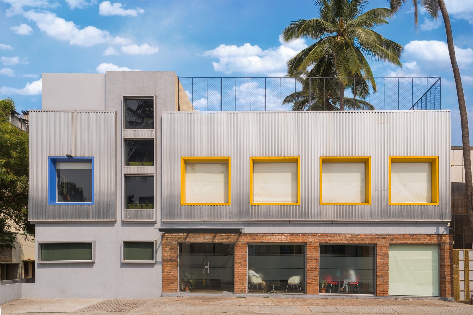
The design for Fitkids an education company offering a variety of products into K-12 schools ranging from physical fitness, STEM, AI etc. was born out of the desire to represent the company in a youthful, quirky and an inspirational manner that showcases the variety and depth of the programs they offer. The building identified by Fitkids was a 45 year old dilapidated structure that had stayed vacant for many years and that had decayed considerably.In addition to the interior design our task was to create an attractive façade without a complete demolition of the same. The quirky design begins with the new aluminium façade which introduces the bright colours of the company at the windows. The design moves through the entire work space in a dynamic manner. The ground and the first floor take on varying looks to represent the varying work spaces that the office required. The challenge lay in converting a dark, dilapidated, old structure into a light, bright and airy inspirational workspace without interfering with the existing structure. A number of bespoke items such as light fixtures, mirrors, standing work stations were created for the office.

